We’re content designers working on GOV.UK and the exemplar services.
We ran our first content for services workshop recently (many thanks to everyone who came along) and wanted to pass on some tips on creating content for services.
Hopefully these will be useful to anyone who is working on transforming a digital service and thinking about how to get across the right information in the right way.
Here are 9 essential tips we shared at the workshop:
- Start with minimum viable content
Start with little or no help text. Then test your service with users, and see which parts they struggle with. It’s easier to add stuff than take it away. - Think about the whole user journey
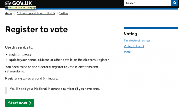
Your service will be part of a wider user journey. Think about how users are likely to get to it. What are they likely to know at that point? What else do they need to know? Once you go into public beta, users will be coming to your service via GOV.UK. So it’s well worth adding a GOV.UK style ‘start’ page to your prototype, so you can test that part of the user journey as well.
- Words are part of the user interface
You can’t fix the words in isolation from the rest of the user interface. The best solution to a problem might involve changes to the language, to the design, or to both. That’s why we work in multidisciplinary teams.So get your content person, designer and user researcher making decisions together. Then test and iterate. - The right words, not more words
If users are struggling with your service, it’s tempting to add help text explaining what to do. But adding more text comes at a cost: it makes the screen more complex for everyone, not just the people who are struggling. Ask yourself whether you really need to ask this question. Is there a different way of asking it?If you decide that you need help text, think carefully about where to place it on the screen. If it’s something that’s relevant to the majority of people, it should probably be ‘inline help’. If it’s only relevant to a minority, it should probably be ‘hidden help’.Remember, when you write more, people understand less. - Don’t explain the interface - improve it
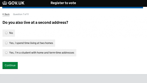
One of the questions in the Electoral registration service is ‘Do you also live at a second address?’. Originally, the options were ‘yes’ or ‘no’. But during testing, we found that users weren’t sure whether their situation ‘counted’ as having a second address. We didn’t want to write a long explanation of what counts as a second address for electoral registration purpose. It would be hard work for the user, and we couldn’t be definitive anyway (ultimately, it’s up to local electoral registration officers to decide).Instead, we added an extra radio button. We don’t actually need to know whether someone is a student or they have a second home, but we found that it’s easier for the user if they can choose an option that describes their situation. - Avoid creating separate ‘help’ pages
You can save users a lot of work by providing help text in context, on the screen where they’re likely to need it. Separate, static ‘help’ pages have a lot of the same problems as FAQs. - Make error messages helpful
Sometimes it’s helpful to explain what caused a validation error so that the user knows how to correct it. For example: “Your password must be at least 10 characters long”. But most of the time, if a user is seeing a validation error message it’s because of a simple typo. In this situation, it’s better to tell them what to do next, not what they’ve done wrong. You just want them to check what they’ve entered - not try to make them understand the validation criteria you’re using.For example - “Enter a date of birth that’s in the past” rather than “Date of birth must be in the past” or “Enter a valid email address” rather than “Email addresses must contain '.' and '@' symbols". - There’s a difference between error messages and exit routes
Use validation error messages to let the user know that they’ve made a mistake and tell them how to correct it. Don’t use validation error messages if you’re telling someone that they don’t qualify to use the service (eg because they live in Scotland, and the service is only available to people in England and Wales). They haven’t made a mistake - it’s just that the service isn’t aimed at them. Instead, create an exit page. Explain that they can’t use the service, and tell them what they should do instead (eg link to the equivalent service for Scotland). - Get your cookies information right
Each service should have its own cookies page, unique to that service. Don’t link to the GOV.UK cookies page, or a page on another website - you’ll be using different cookies. But by all means use the GOV.UK cookies page as a template.
What do you need from the GDS content team?
We had lively Q&A at the end of the workshop. From that, it seems that people want more:
- examples of service-type content done well (and not so well)
- advice on how to handle legal and privacy content - declarations, privacy policy etc
- advice on how to handle longer, ‘essay’ type questions (we’ve started a hackpad for anyone who wants to share ideas)
We’ll look into these things. In the meantime, let us know in the comments if you have any other ideas.
Content help for service teams
If you’re working on transforming a digital service, you can sign up to the 25 September workshop now.
We think the best people to come to these workshops are:
- service managers
- digital transformation managers
- anyone who'll manage content and design on a service
Or if you want an individual consultation with a GDS content designer, ask your department or agency single point of contact to raise a content request.

2 comments
Comment by Alan Maddrell posted on
Love this. Service managers, heed. Heed!
Comment by Dave posted on
Great to see GDS getting to grips with help for those writing for services. The 'less is more' message needs to be understood much more widely.